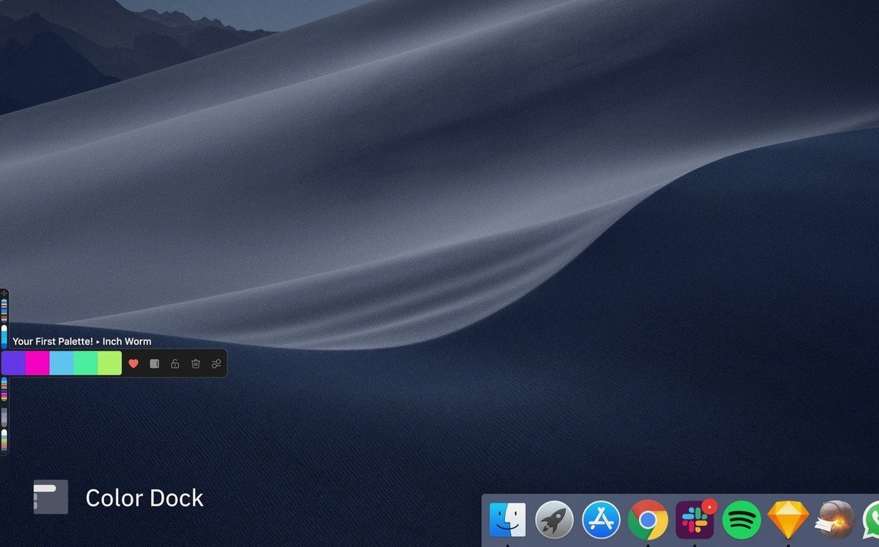
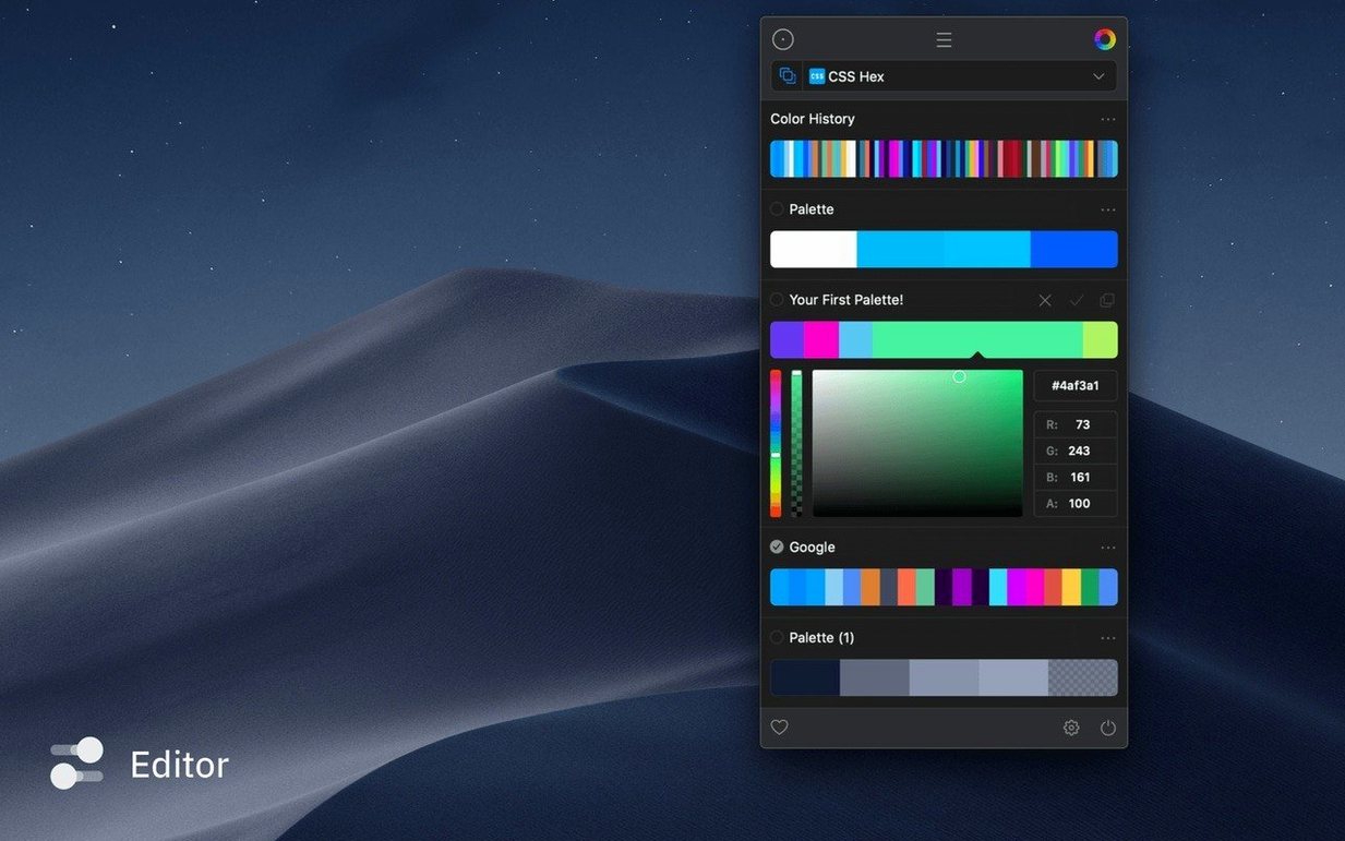
You are roughing out a poster in Photoshop, and the blue from the director's reference still is just slightly off. The eyedropper skips between windows. Sip docks a slim colour panel to the left edge of your display so the sampler stays put while you move between apps, collecting the cobalt of the still, the muted ochre of a location-scout photo, and the exact red of the title card.
Native speed on Intel and Apple Silicon from macOS 12.3
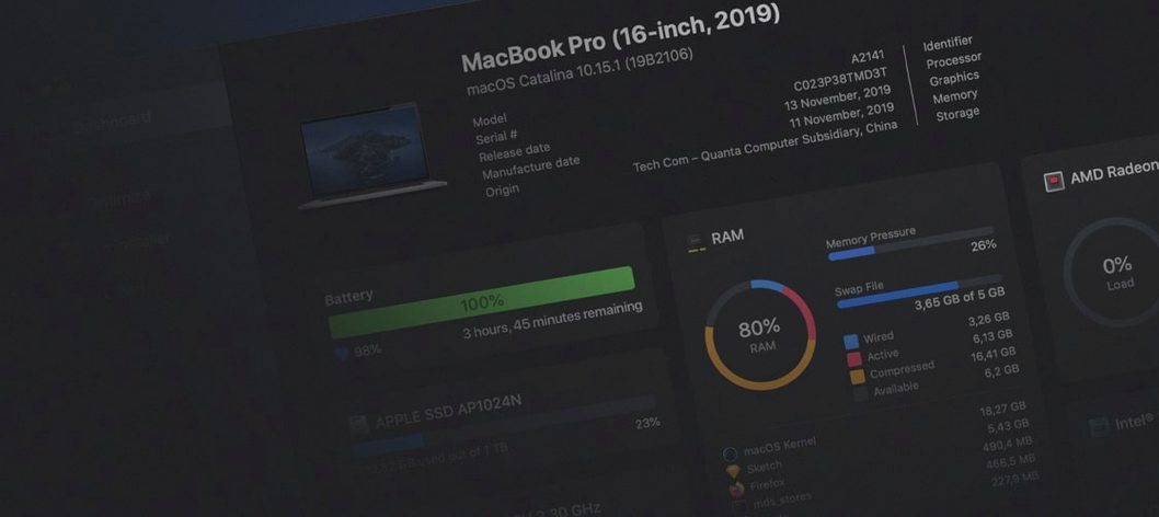
Sip 5.1 asks for macOS 12.3 or later. It runs natively on both Intel and Apple Silicon machines, so it feels quick whether you are on an older iMac or a current MacBook Pro. No secondary frameworks or runtimes to chase down.
Pick a colour, name it, and assign it to a palette
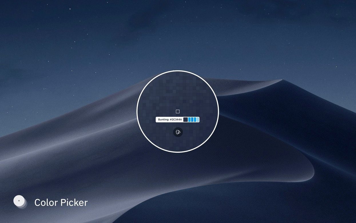
A workflow unfolds in a few steps. First, you grab a colour anywhere on screen with the system-level magnifier. The colour lands in a tray where you can name it and assign it to a palette — your short's palette, a client brand sheet, a set of UI tints. Next, you check contrast ratios against another swatch, which is useful when you are burning subtitles or laying credits over a dark frame. From there you can export a snapshot of the palette as an image, or email a palette file to a colourist. The app keeps a history of recent picks, so the coral you sampled three hours ago is still waiting when you need it again.
Small moves that speed things up
Some of Sip's best thinking hides in plain sight. Hold Shift while clicking to sample multiple colours in quick succession without the magnifier dismissing itself — handy when you are pulling a full scheme from a single frame of reference footage. Ctrl-click a swatch to duplicate it into another palette instead of dragging, which keeps your project palette and your master library in sync without reshuffling windows. The docked panel remembers its width between sessions, so you can collapse it to a narrow strip when you are deep in layout work and expand it again for palette editing.
The Cmd-click shortcut deserves more attention than it gets. With a colour selected in Sip, hold Cmd and click into any text field or colour well in another app — Photoshop's colour picker, a CSS variable in your editor, a fill dialogue in Sketch. Sip drops the hex or RGB value straight in, no clipboard dance required. It works with custom formats too: define a Swift-friendly Color(red:green:blue:) template once, and Cmd-click delivers a perfectly formatted line wherever you place the cursor.
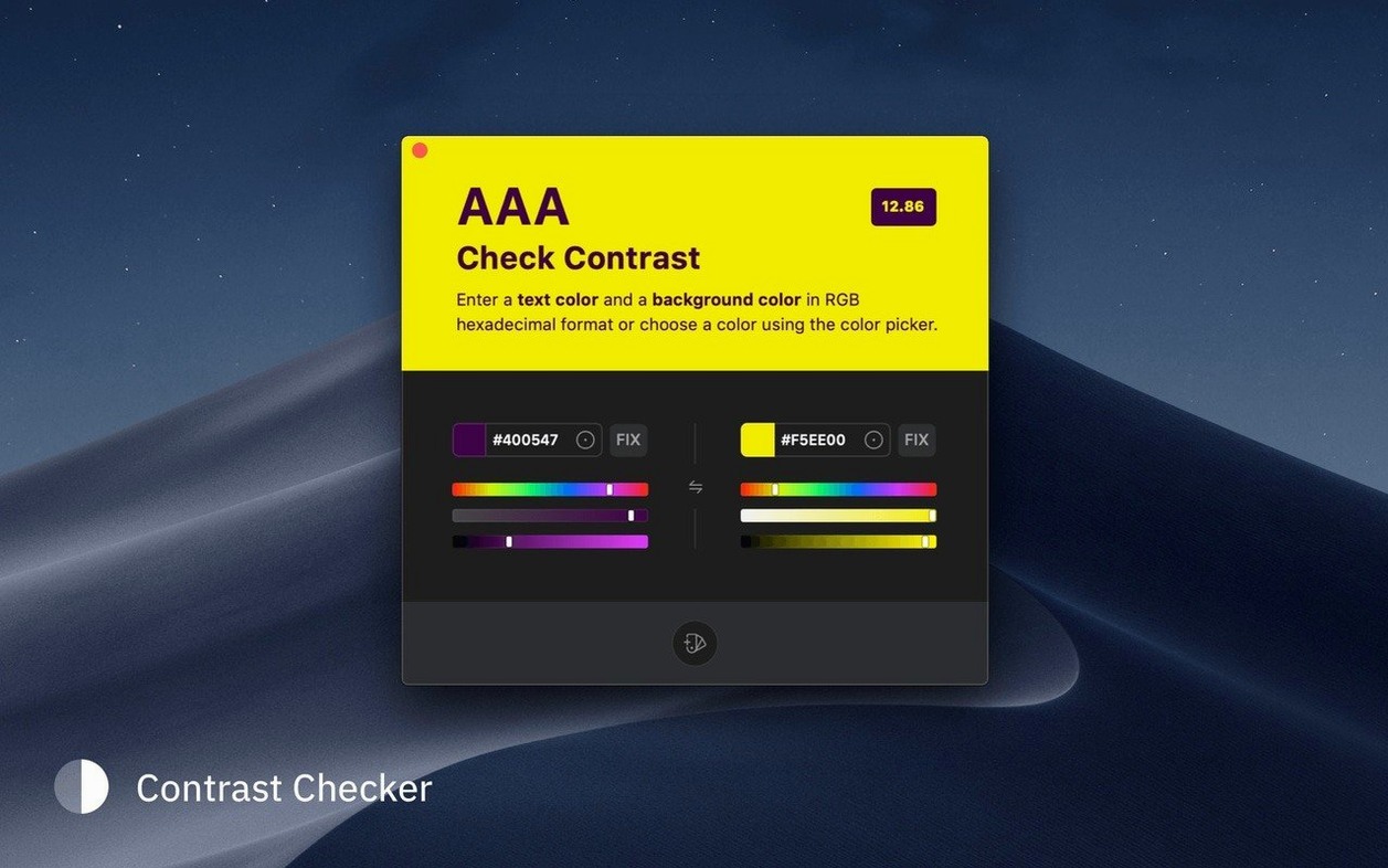
Contrast checking goes further than the obvious foreground-on-background pairing. Enable the auto-correct toggle and Sip nudges the lighter or darker swatch until the ratio clears WCAG thresholds, showing you the delta visually. You can lock one colour — say, a brand orange that cannot shift — and let the app adjust only the background. For subtitle work, the feature quietly saves you from delivering white type on a low-contrast sky.
A palette from scouting to grade
Imagine you are pulling a colour script for a short film. You start by opening location stills in Preview. Sip is docked to the right, set to stay on top. You Shift-click through five colours in a single photo — the teal of a peeling door, the warm grey of overcast concrete, a rust stain on corrugated metal, the yellow of a streetlamp diffused through fog, and the near-black of wet asphalt. Each lands in a temporary tray. You name them quickly: door teal, concrete grey, rusted corrugated, and so on. Dragging them into a palette called Docklands Night takes seconds.
Over the next hour you repeat this across four more location stills, building a palette of eighteen colours. You check the contrast between concrete grey and a proposed credit-block white. The ratio is 4.2:1 — borderline. You toggle auto-correct, lock the grey, and Sip suggests a slightly warmer white that hits 7:1. You note the new value. Before the location walk ends, you email the palette file to your colourist and export a snapshot PNG to drop into the director's treatment deck. The whole thing happened without opening a single palette manager inside a creative suite.
One pick outputs CMYK, SwiftUI, and SCSS simultaneously
Designers who shuttle between print and screen work get a lot from Sip's custom format editor — a single pick can output a CMYK breakdown, a SwiftUI colour literal, and a SCSS variable without retyping. Front-end developers benefit from the contrast tools baked into a picker they already keep open, which means accessibility checking stops being a separate step and becomes something you catch as you sample. Video editors and motion designers who pull colour from reference frames find the docked panel especially useful because the sampler stays put while the timeline app takes over the rest of the display.
Less obvious is the value for anyone managing a living palette across a long project. Sip's snapshot history means you can trace back to the exact moment you sampled a colour two weeks ago, even if you never saved it to a named palette. The app does not pressure you to organize on the spot — it keeps a generous backlog, and you impose order when you are ready.
If your work involves a lot of colour sampling across applications, the cumulative effect of these small shortcuts — staying in flow, skipping the clipboard, checking contrast early — adds up faster than you expect. Sip does not try to replace the colour tools inside your creative apps. It sits beside them, quietly making the routine parts of colour work feel less like friction.
- macOS 12.3 or later
- Runs on Intel and Apple Silicon Macs