
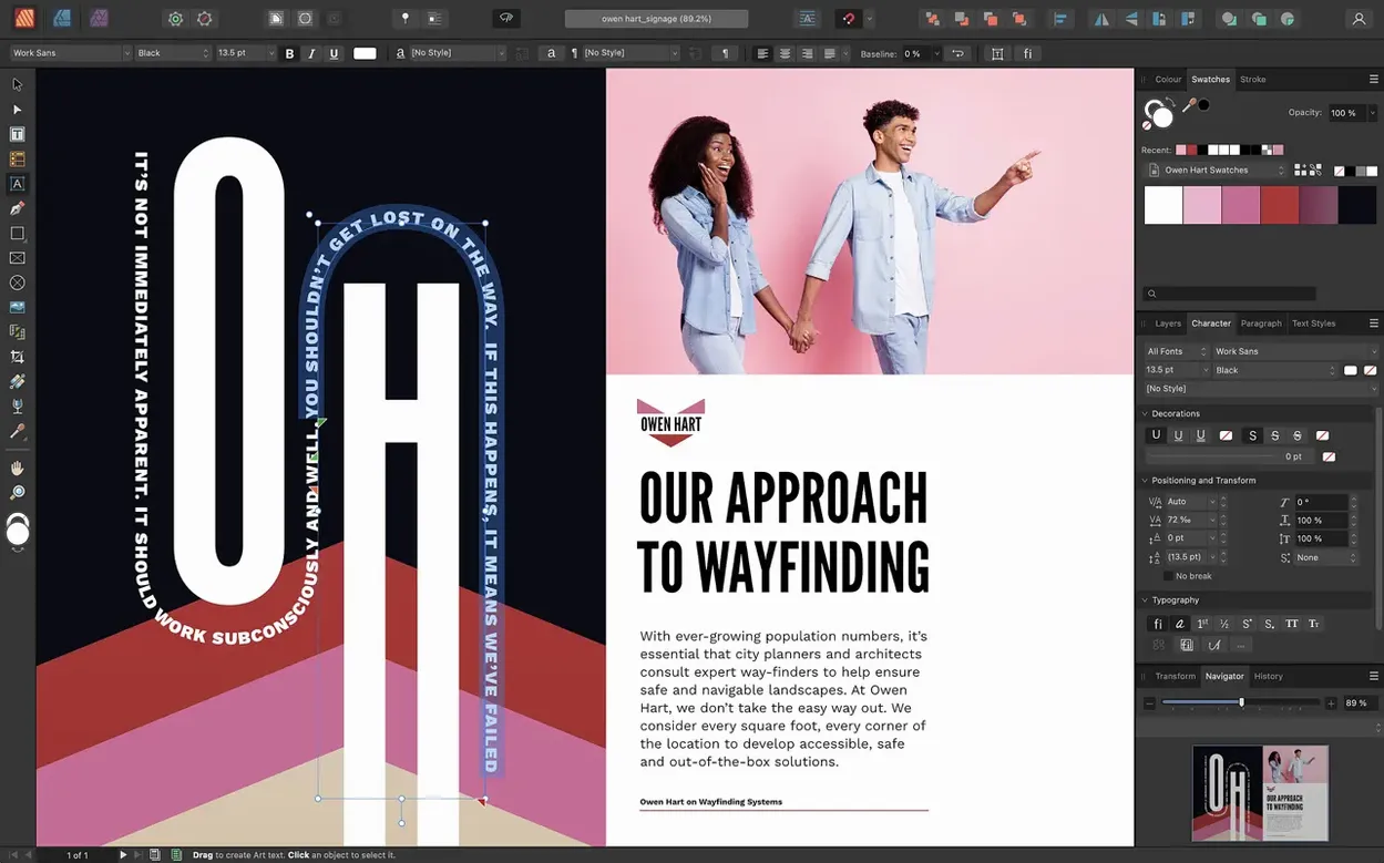
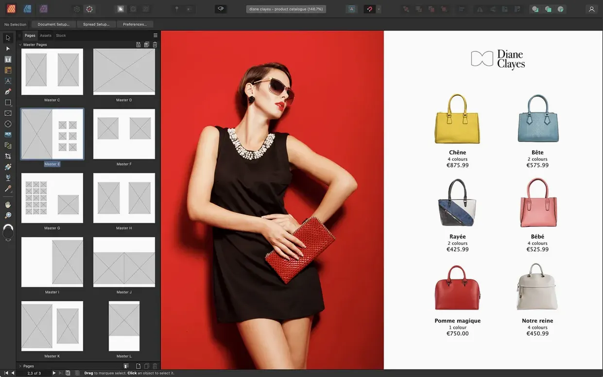
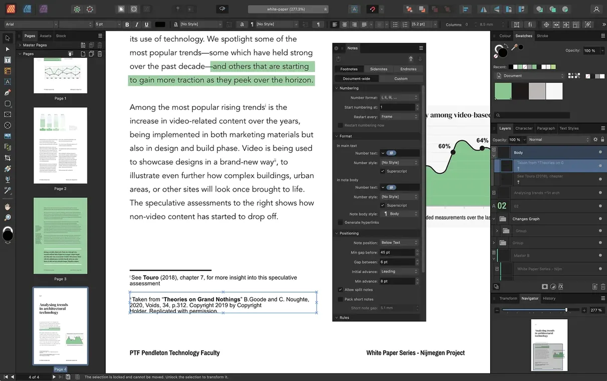
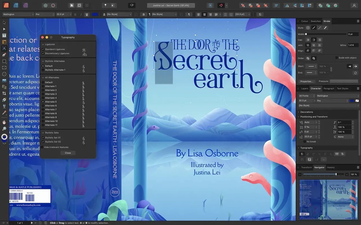
Multi-page spreads arrive properly in version 2.6 — the kind that let a gatefold open across three panels or an accordion brochure fan out across the table. The Reading Order panel lands for the first time too, so a PDF exported from your layout can carry its narrative structure into screen readers.
Can a single spread hold more than two pages
Yes. Starting with the 2.6 release, a spread can gather several pages side by side, which changes everything for trifold flyers, gatefold covers, and any print piece that opens outward in sequence. The modeless pages panel makes it feel like a natural extension of the pasteboard, not a special mode you have to learn.
Drag article boxes so screen readers narrate in the right sequence
The new Reading Order panel lets you drag article boxes into the right sequence so a screen reader narrates your layout in the intended order — headlines before captions, sidebars after body copy. It is a quiet but significant tool for editorial designers working with institutions, government, or any client who treats accessibility as a requirement rather than a checkbox.
What does the StudioLink integration actually do on macOS
If you also have Affinity Designer and Affinity Photo installed, Publisher switches their tool sets into its own interface without launching separate apps. You can adjust a vector logo with Designer’s node tool, retouch a placed photo with Photo’s clone brush, and return to text frames — all inside the same document window.
What the 2.6 releases changed in daily work
Before version 2.6, building a trifold brochure meant working across three separate spreads and hoping the printer's imposition software understood your intent. Now you design the whole piece as one continuous spread — three panels sitting side by side on a single pasteboard. The fold lines are visible, the gutters between panels stay consistent, and you can flow a headline across all three faces without a workaround. The same logic applies to gatefolds, where the outer panels tuck inward, or accordion folds that zigzag through five or six faces. It is less a new feature and more a correction of something that always felt missing.
On screen, the multiple-page spread behaves like any other layout surface. Guides snap across panel boundaries, master page elements can span the full width or repeat per panel, and text frames link across the fold as easily as they link across a standard two-page spread. If you have ever built a concert programme or a festival map that needed to open wide, the difference is immediate — you stop fighting the page structure and start designing the object itself.
The Reading Order panel, added in the same release, shifts the conversation about accessibility from export settings to the layout stage. A PDF exported for screen readers needs its content tagged in a logical sequence, and until 2.6 that meant post-processing in Acrobat or relying on the export engine's best guess. Now you open the panel, see a flat list of text frames and images, and drag them into order: title first, byline, body copy, pull quote, caption. The tags embed directly into the exported PDF. For a university press or a city council report, that panel turns a compliance headache into ten minutes of sorting.
How Publisher fits into a wider creative workflow
Affinity Publisher is not an island. The StudioLink system means that with Designer and Photo installed, you toggle between three applications inside one window. Click the Designer persona and the toolbar shifts to vector tools — the Pen tool, the Node tool, boolean operations — without leaving your layout. Switch to the Photo persona and you get a full raster editing stack: clone brush, dodge and burn, non-destructive adjustment layers applied to a placed image right where it sits in the spread. There is no round-trip to an external editor, no flattened TIFF to re-import when the art director changes their mind.
Outside the Affinity ecosystem, Publisher reads and writes formats that keep it in conversation with the rest of a studio. Place a layered PSD from a photographer and it stays editable; place an AI file from an illustrator working in Illustrator and you can adjust its artboards on import. Drag in a PDF and each page lands as an embedded document you can scale, crop, or double-click to edit. On the export side, the PDF/X presets cover the standards most commercial printers expect, and the spot colour support — including Pantone libraries — means a two-colour job stays two colours all the way to the plates.
macOS integration runs deeper than you might notice at first. Publisher speaks the system's colour management through ColorSync, so a calibrated display profile flows through to soft-proofing and export. The document thumbnails show up in Finder and Quick Look. You can drag a photo straight from Photos.app onto a picture frame, or drop a Pages document and watch the text flow into your linked frames. Sidecar and Universal Control turn an iPad into a palette extension — not a full layout surface, but a quick way to nudge a mask or adjust a curve with the Pencil while the spread fills the Mac display.
Twenty-four pages, three nested masters, and a Friday deadline
The magazine section is due Friday. You open the issue file — a twenty-four page document built on a nested master page system. The section master inherits from the issue master, and the feature opener master inherits from the section master. Changing the running head in one place ripples through every article.
You start with the opener. The photo editor sent a 16-bit TIFF from Capture One. You drag it onto the right-hand page, drop it into a picture frame, and switch to the Photo persona. A quick curves layer lifts the shadows without touching the original pixel data — the adjustment sits above the placed image in the Layers panel, live and reversible. Back in the Publisher persona, you set the text wrap to tight and watch the body copy reflow around the subject's shoulder.
The sidebar needs a pull quote. You draw a text frame, paste the quote, and assign the Pull Quote paragraph style. The style carries its own typeface, weight, and a rule above — defined once, applied everywhere. You link the sidebar frame to the next column, and Publisher's text flow indicator shows you exactly how much overset text remains.
Midway through, the editor sends a revised chart as an AI file. You place it, double-click to enter the embedded document, and tweak the stroke weight of the trend line using Designer's node tools without ever seeing a separate window. The change propagates back to the layout instantly.
Before wrapping up, you open the Reading Order panel. The article spans three text frames, two captions, and a breakout box. You drag them into the narrative sequence — headline, deck, body, breakout, caption one, caption two — and the tags write themselves into the export. You output a PDF/X-4 for the printer and the same file, with reading order intact, goes to the client's accessibility review.
First days with Publisher: practical ground to cover
Start with master pages before you place a single text frame. Set up a base master with your margins, columns, and running heads, then build nested masters for section variations. The time you spend here pays back at every deadline. Publisher's master page inheritance — where a child master can override elements from its parent without breaking the link — rewards a little upfront planning with remarkable flexibility later.
Learn the picture frame tool early. Unlike a free-floating image, a picture frame lets you scale and crop a placed photo without resizing the container, and the frame's properties panel controls how the image fits. Set your default frame to "None" for fill so new images land at their native resolution, then adjust per frame as needed.
Set up your paragraph and character styles in a blank template document and save it as a .aftemplate file. Include your colour palette, your baseline grid settings, and a few sample text frames with realistic copy so you can test hyphenation and justification before a live project exposes them. The template stays on your drive, ready for the next book, brochure, or zine.
When you place a PDF for reference — a client's old brochure, say — use the passthrough option in the import dialog. The placed pages render faithfully without flattening, and you can toggle visibility per page in the Links panel. It is an underrated way to rebuild a legacy document with the original sitting right behind your new layout for comparison.
Version 2.6 brings multiple-page spreads to the pasteboard, along with foldable spread types — gatefolds, trifolds, and accordion folds — so a single layout can span three or more panels. A Reading Order panel also arrives, giving designers control over how screen readers traverse a tagged PDF.
- macOS 10.15 or later
- Apple M-series chip or Intel processor
- 8 GB RAM recommended
- Up to 2.8 GB of available drive space; more during installation
- Display resolution 1280×768 or larger