

Microsoft PowerPoint 16.93 is the latest Mac release of the presentation tool that trades blank slides for a set of intelligent visual aids.
Designer — a layout engine that watches you drop an image onto a slide and quietly offers half a dozen polished arrangements in the sidebar. The days of nudging a photo pixel by pixel while the clock ticks down are behind you.
Morph — a transition that calculates the smoothest path between two slides sharing the same object, making a circle drift into a new position or a word swell in size without a single keyframe. It reads more like a camera move than a slide advance.
Presenter Coach — a rehearsal partner that listens for pacing, filler words, and even culturally sensitive phrases, then gives a quiet report before you stand in front of a room. It turns a solo run-through into something closer to a real feedback session.
Stock visuals — a built-in library of icons, cut-out people, and 4K footage that drops straight onto the canvas. You reach for a establishing shot of a city skyline without leaving the app, which keeps the visual tone consistent from first sketch to final export.
Starting a grant pitch from a blank title slide and cold coffee
I opened PowerPoint around eight on a Tuesday, coffee going cold on the desk, staring at the default title slide. The task was a pitch deck for a short film grant — the kind where the panel has seen thirty decks that week and yours needs to feel like a trailer, not a spreadsheet.
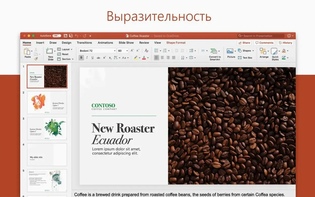
I typed the working title across the top placeholder, then dropped in a still from the location scout. The moment the image landed, Designer flickered to life on the right — six layout suggestions, each treating the photo differently. One bled it full-bleed with the title overlaid in white; another cropped it into a circle beside the text. I picked the full-bleed option and moved on.
The second slide needed a timeline. I pulled three milestone shapes from the Insert menu, spaced them across the width, and labelled them Pre-production, Principal photography, Post. A quick right-click on each, a colour fill pulled from the location still, and the slide started to breathe. I duplicated it for the next slide, swapped the milestones for crew headshots, and applied Morph. Watching PowerPoint calculate the in-between — headshots gliding left as the timeline faded — felt closer to a dissolve in an edit timeline than a presentation trick.
By slide seven I was in the rhythm. I grabbed a drone shot from the stock footage library (typed forest road aerial into the search bar, dragged the clip onto the slide) and set it to autoplay. The panel would see the road unspool beneath mist while I talked about tone. No external files, no Finder hunt.
I hit Presenter Coach before shutting the lid. It flagged four ums in three minutes and suggested I slow down during the budget slide. Fair.
Automatic Designer unlocks design suggestions before your first real deck
PowerPoint ships with defaults that lean conservative. A few tweaks make the canvas feel like yours from the first slide.
Turn on automatic Designer. Under Preferences > General, tick Automatically show me design ideas. Without this, you have to summon Designer manually every time. With it, every image drop or layout shift prompts a quiet sidebar of alternatives — unobtrusive, easy to ignore, but there when you need it.
Set default shape formatting. Draw a rectangle, style it with your preferred fill, outline weight, and shadow. Right-click it and choose Set as Default Shape. Every rectangle, arrow, and callout you draw from that moment inherits those choices. This alone saves twenty minutes of reformatting per deck.
Adjust the Quick Access Toolbar. I keep Align Center, Align Middle, Bring Forward, and Send Backward up there. The ribbon has these buried in menus; the toolbar puts them one click away. On a laptop screen where every pixel counts, that matters.
Switch the default save location. Preferences > Save lets you point PowerPoint at a project folder instead of the generic Documents path. If you work across multiple drives — I keep a working drive for active projects — this prevents the Friday scramble of hunting down stray .pptx files.
Gathering stills, logos, and clips to build a cohesive visual submission
This is the process I follow when a deck needs to feel cohesive and visual, not just informative — grant applications, investor decks, festival submissions.
Step one: gather assets before opening PowerPoint. I drag every still, logo, and video clip into a single Finder folder named after the project. PowerPoint can link or embed, but having everything in one place avoids broken media paths later.
Step two: build a slide skeleton. I start in Outline View — no design, just slide titles and bullet points flowing down the left panel. It forces me to structure the argument before I dress it. A ten-slide deck might take fifteen minutes in outline and save an hour of rearranging later.
Step three: apply a consistent visual thread. I pick three colours from the key image — the location still or the poster mockup — and add them to the theme colours under Slide Master > Colors. Every shape, chart, and text highlight now pulls from the same palette without me thinking about it.
Step four: replace text with visuals where possible. A bullet point that says forest setting, early morning is weaker than a full-bleed still of the location with the words overlaid. I go slide by slide and ask: can this sentence become an image? Designer helps here — dropping in a photo often surfaces layouts I wouldn't have thought to build manually.
Step five: add movement sparingly. I apply Morph between two or three pairs of slides where motion clarifies a relationship — a character arc, a budget breakdown that expands, a timeline that advances. I avoid the animation pane for entrance effects. A deck full of flying bullets feels nervous; a deck with one well-placed Morph feels considered.
Step six: rehearse with Presenter Coach. I do three full run-throughs. The first is for flow, the second for timing, and the third with Coach listening. By then the ums are down and the pacing notes are specific enough to act on.
Step seven: export and test. I save a .pptx for myself and export a .pdf for the panel. The PDF ensures fonts and layouts survive whatever machine opens the file on the other end. If video is critical, I test the .pptx on a second Mac before sending.
Running an old deck through Designer slide by slide to learn its layout logic
On day one, open a deck you already know well — an old pitch, a lecture, anything — and run it through Designer slide by slide. Don't accept every suggestion, but watch what the engine proposes. It teaches you layout possibilities you might not reach on your own, and by the end of the deck you'll have absorbed a dozen new ways to arrange image and text.
On day two, build something small from scratch: a five-slide photo essay, a quick lookbook, a weekend itinerary. The goal isn't the output; it's learning where the tools live without the pressure of a deadline. Draw shapes and change their defaults. Apply Morph between two slides and tweak the transition duration in the Timing pane. Record a narration clip and trim it in the Audio Format tab.
On day three, pick a deck you'll need next week and build the skeleton — Outline View, slide titles, a rough structure. Drop in one piece of stock video from the built-in library. By now the interface should feel less like a ribbon of unfamiliar icons and more like a workspace that bends to your habits rather than Microsoft's assumptions.
If you're coming from an older version or a different tool entirely, give yourself permission to ignore features. The animation pane, the 3D model insertion, the chart engine — they'll still be there when you need them. What matters in the first week is building muscle memory for the five or six actions you'll repeat a hundred times: align, distribute, morph, export, rehearse.
PowerPoint arrives as part of the Office suite release 16.93, which rolls up the latest fixes and keeps the app aligned with the rest of the Office 2024 family.
- macOS 13 or later
- Apple silicon or Intel 64-bit processor
Questions from the booth
Yes, it includes native support for both Apple silicon and Intel 64-bit architectures, so performance feels immediate on any recent Mac.