
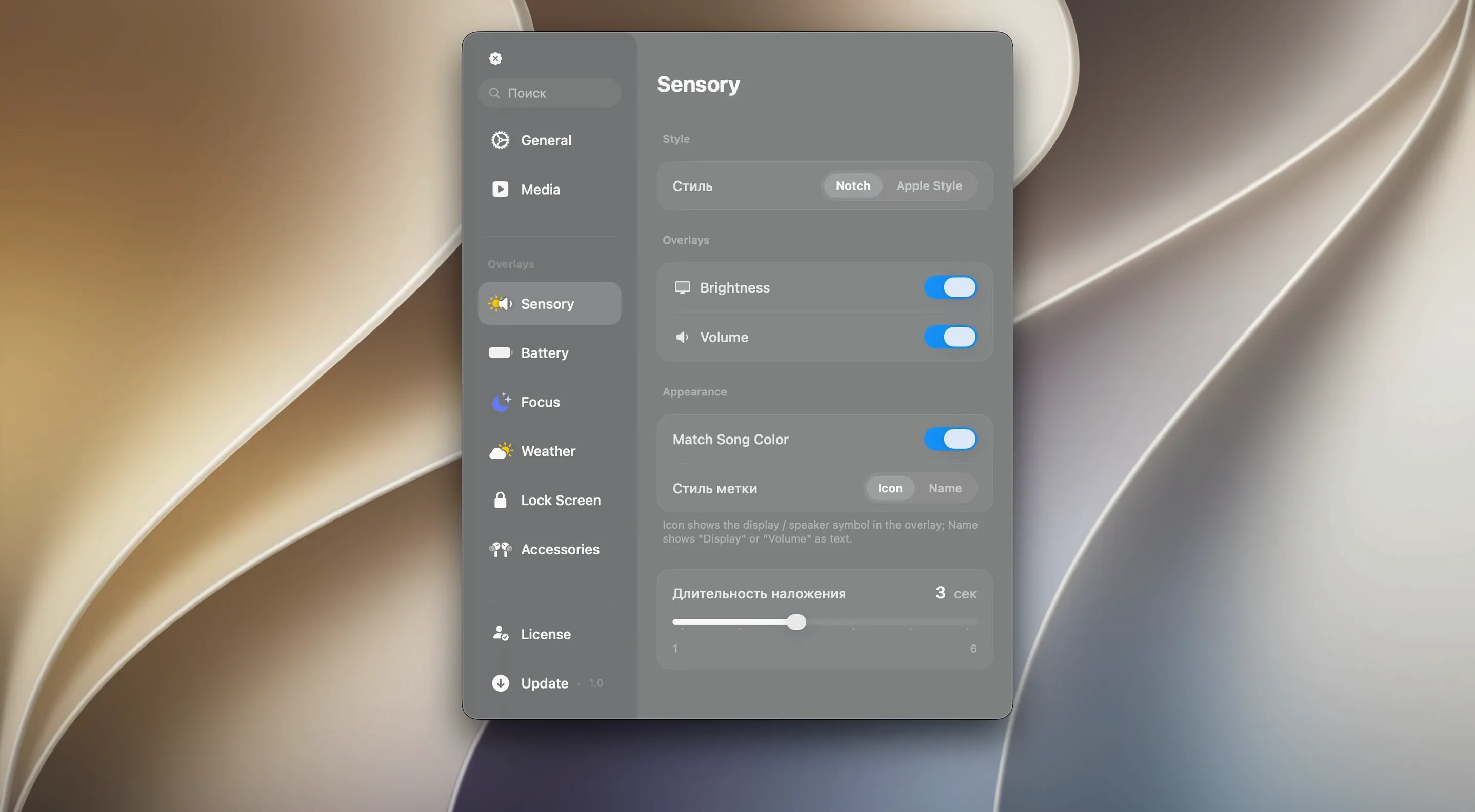
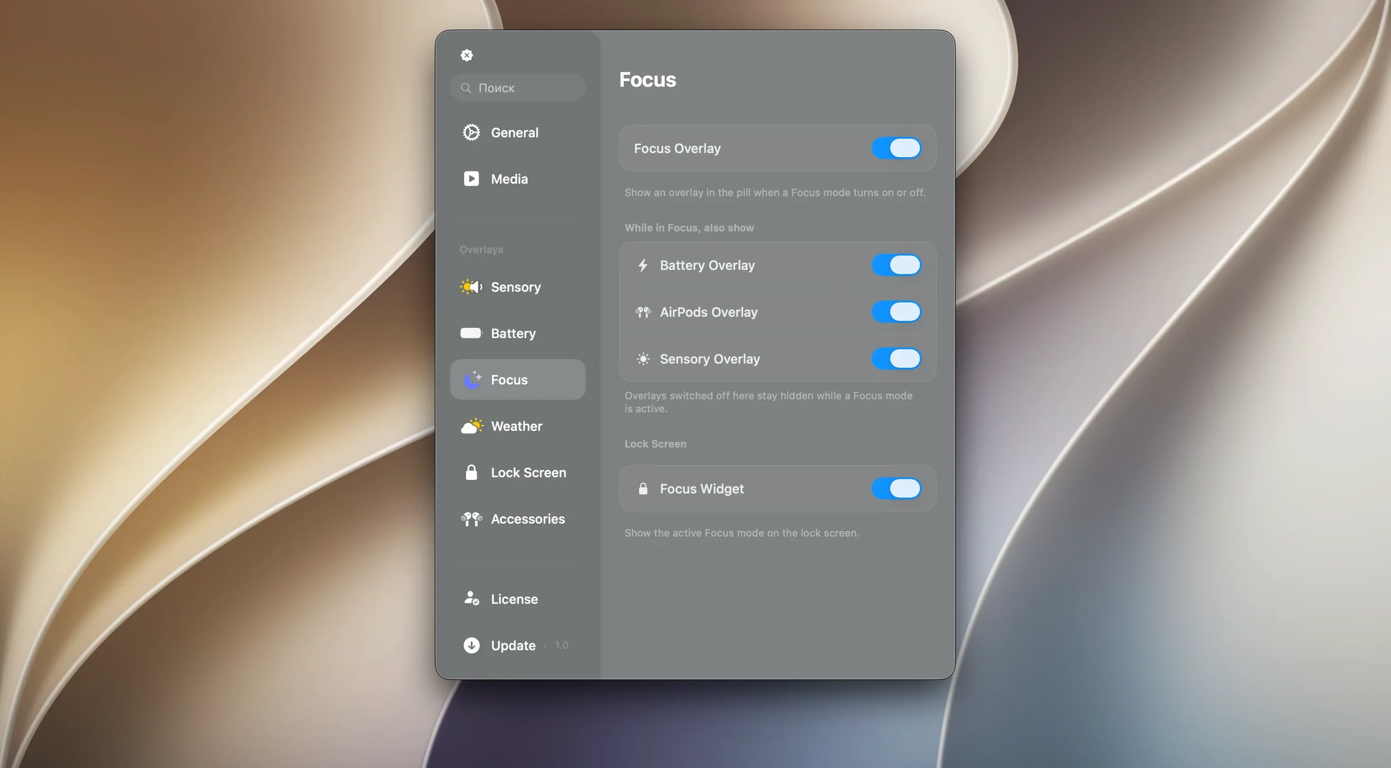
Canopy attracts two kinds of people: those who genuinely miss the glanceable, compact controls from the iPhone's Dynamic Island, and those who just want a tidier way to track timers, music, and notifications without jumping back to the app that owns them. It lands somewhere between a utility and an aesthetic choice—a small panel that lives in your menu bar or notch and reacts to what your Mac is doing.
Nestles into your notch like a native feature
The short answer is yes. Canopy is designed to work on any Mac, with or without a notch, as long as it runs macOS 26. On notched MacBooks, it nestles into the screen cutout like a native feature. On older machines or external displays, it creates a floating widget that sits against the top edge of the screen, with the same Liquid Glass translucency and the same tap-to-expand behaviour. There is no second-class experience for pre-notch hardware.
What exactly does it do?
Think of it as a live readout for things that are happening in the background. A timer counting down, the track you are playing, an incoming notification—each appears as a compact pill that expands with a click to show finer controls or more detail. The interaction model borrows heavily from the Dynamic Island: tap to expand, swipe to dismiss, and a brief animation whenever something new starts or finishes. It is not a dock replacement or a full notification centre; it is a small, reactive strip that keeps a few threads of your day visible without stealing focus.
A countdown that stays visible through pomodoro sessions
Not every Mac user will notice Canopy in the same way. The people who latch onto it tend to share a few habits. If you work with a timer running in the background—pomodoro sessions, long renders, laundry cycles—the always-visible countdown spares you the ritual of pulling up a separate window just to check how many minutes are left. Musicians and editors who keep playback controls within reach describe it as a small but genuine friction remover: skipping a track or pausing a podcast without leaving a full-screen timeline becomes muscle memory after a day or two.
There is also a quieter audience that simply likes how it fills the dead space around the notch. On a MacBook Pro, the menu bar can feel like wasted real estate; Canopy turns the cutout into something that earns its place. Users who keep a clean desktop and hide their dock often remark that the Liquid Glass panel adds a layer of polish without demanding attention. It is the kind of utility that rewards people who already lean toward minimal setups—less for the power user who lives in a storm of windows, more for the person who curates what stays visible.
Long-press the timer pill for an instant reset
A few conveniences are easy to overlook if you only use the obvious tap-and-expand gestures. The timer pill, for instance, responds to a long press with a quick-reset option, which saves a trip into the main app that set the timer. If you are playing music and a notification arrives, the panel slides the album art aside rather than stacking on top of it—a detail that feels minor until you have seen the alternative. And on Macs without a notch, the floating widget remembers where you last dragged it, so repositioning it once tends to stick across restarts.
One shortcut that rarely appears in first-time explorations: holding the Option key while clicking the panel expands every active live activity at once, giving you a snapshot of timers, media, and recent notifications in a single glance. It is not documented prominently, but it changes the rhythm of checking in. There is also a quiet-hours toggle tucked into the right-click menu that dims the panel and silences animations during a set window—useful for late-night writing sessions where even a subtle glow can pull you out of a thought.
Pulls playback state from Apple’s own media controller
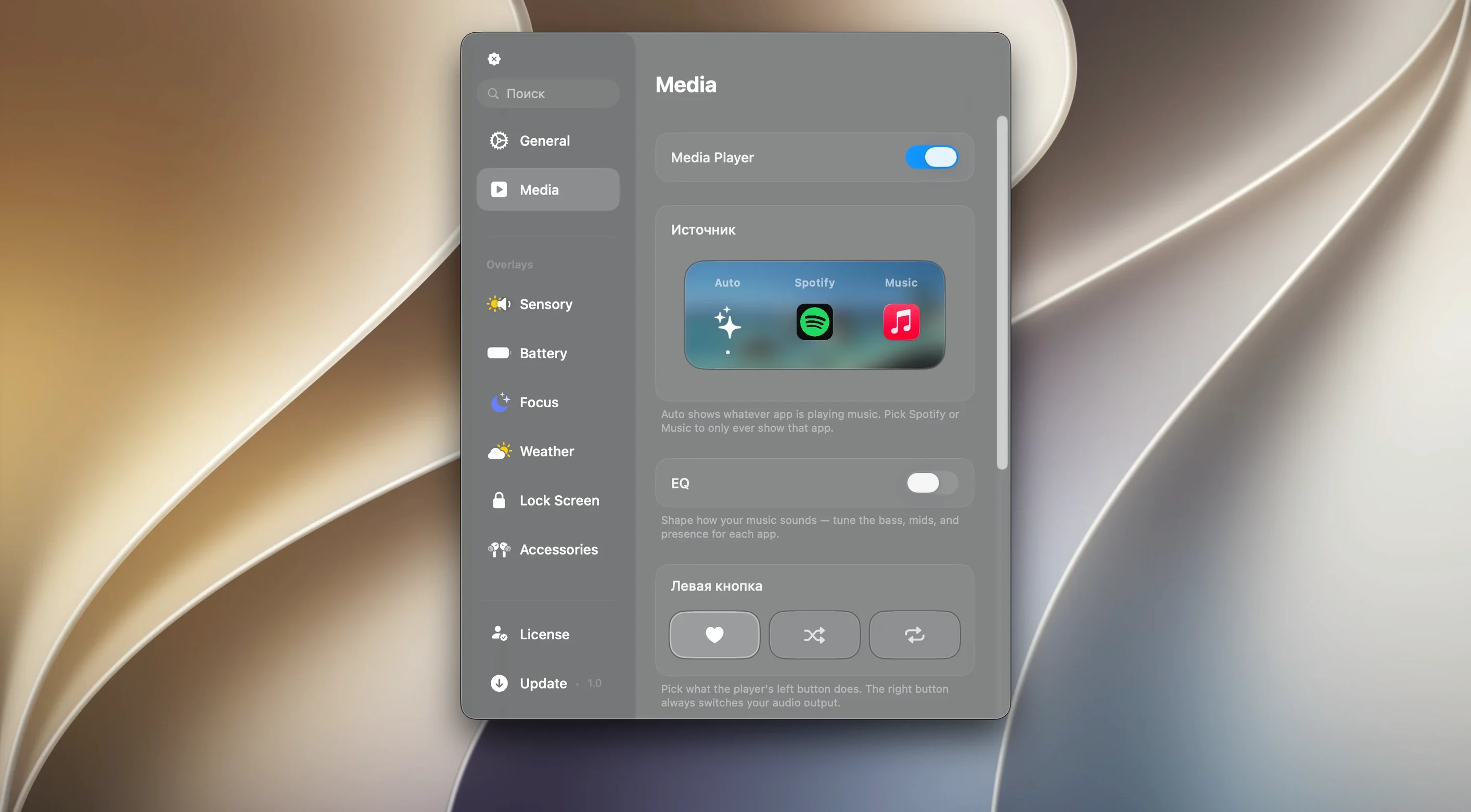
Canopy does not try to replace Notification Centre or wrestle control away from Music and Spotify. It works alongside them, pulling metadata and playback state from the system's own media controller, which means it stays in sync with whatever Apple's Now Playing framework sees. If you use third-party timers like Horo or standalone countdown utilities, Canopy picks up those live activities too, though the integration depth varies depending on how each app exposes its data.
The larger macOS ecosystem matters here in a specific way. Because Canopy lives entirely in the menu bar and screen edge, it sidesteps the window-management tangles that come with floating overlays and Dashboard-style widgets. It does not compete for keyboard focus, it does not appear in your app switcher, and it respects Stage Manager and full-screen spaces without glitching. That restraint is what lets it feel native rather than bolted on. You can combine it with Bartender or Hidden Bar to tidy the rest of your menu bar, and the two coexist peacefully—Canopy's panel sits independently of whatever icon-hiding rules those apps enforce.
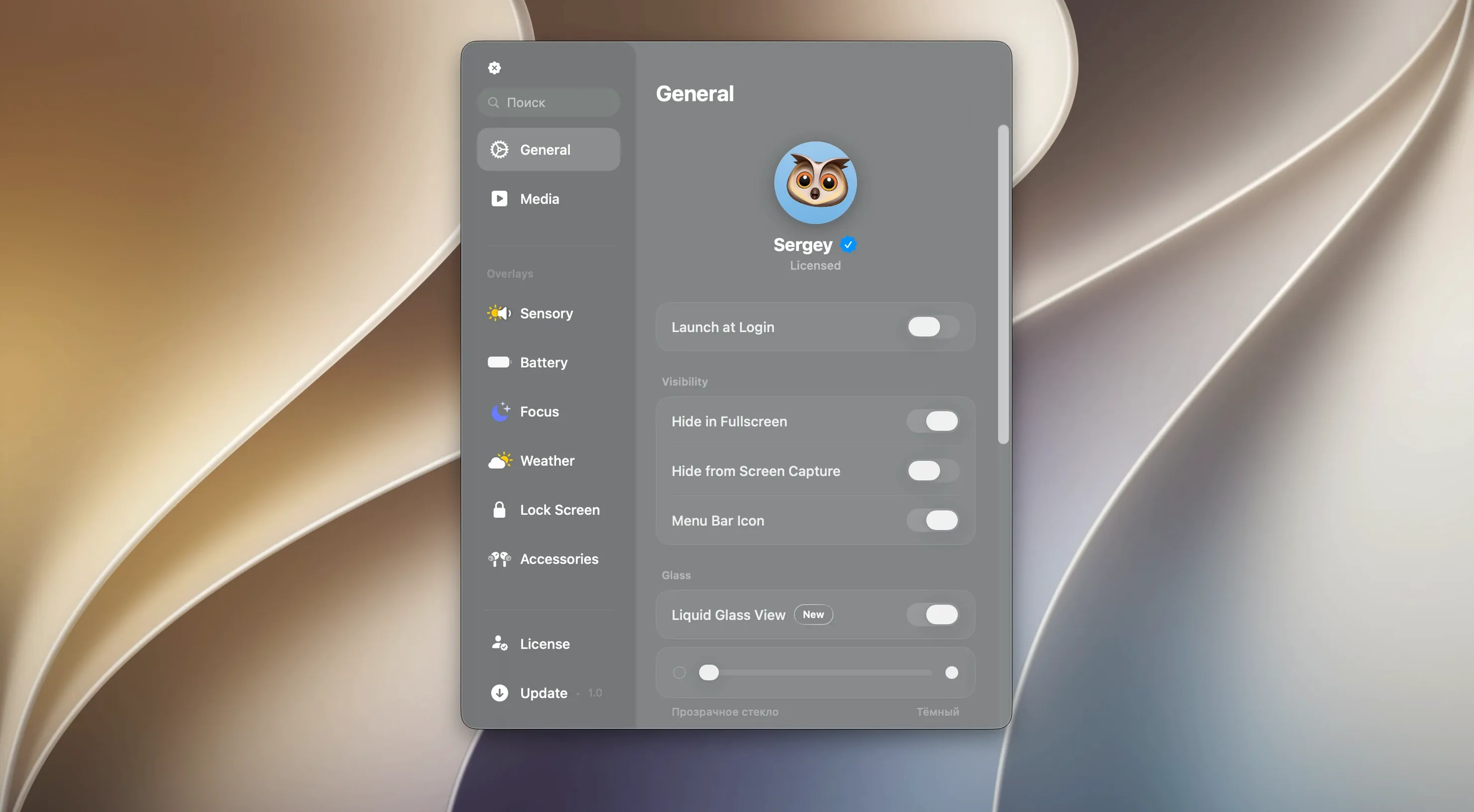
On the accessibility side, the Liquid Glass translucency can be dialled back in the appearance settings, and the panel respects macOS 26's system-wide reduce-transparency toggle. VoiceOver users get spoken labels for each active pill, though the swipe-to-dismiss gesture still requires a trackpad or mouse.
The panel waits longer before collapsing after a notification
Version 2.1.0 tightened a handful of everyday behaviours that early adopters had flagged. The panel now waits a beat longer before collapsing after a notification is dismissed, which gives you time to read a longer message without rushing. Music controls gained a scrubbing gesture—sliding left or right on the expanded track view—that was absent in earlier releases. On notched MacBooks, the alignment algorithm was reworked to account for the slightly different cutout dimensions across 14-inch and 16-inch models, so text no longer clips at the edges on the smaller screen.
The floating widget on notchless Macs also received attention. It previously defaulted to a fixed horizontal position after each wake; now it restores its last placement, which matters if you have centred it above a specific workspace or nudged it away from a cluttered corner. Behind the scenes, the Liquid Glass rendering was moved to Metal, which reduced the panel's energy impact during long idle stretches—noticeable if you leave a timer running while on battery. None of these are headline features, but taken together they make Canopy feel less like a clever experiment and more like something that has settled into a steady, unobtrusive rhythm on the desktop.
- macOS 26 or later
- Apple Silicon or Intel Mac
Questions from the booth
No, it works on any Mac running macOS 26, creating a floating top-edge widget on displays without a notch.
It surfaces compact, expandable pills for timers, music playback, and notifications, with a tap-to-expand interaction style.
They are translucent, depth-aware visual effects that give the panel its distinctive glassy look, matching the app's refined, productivity-focused design.