
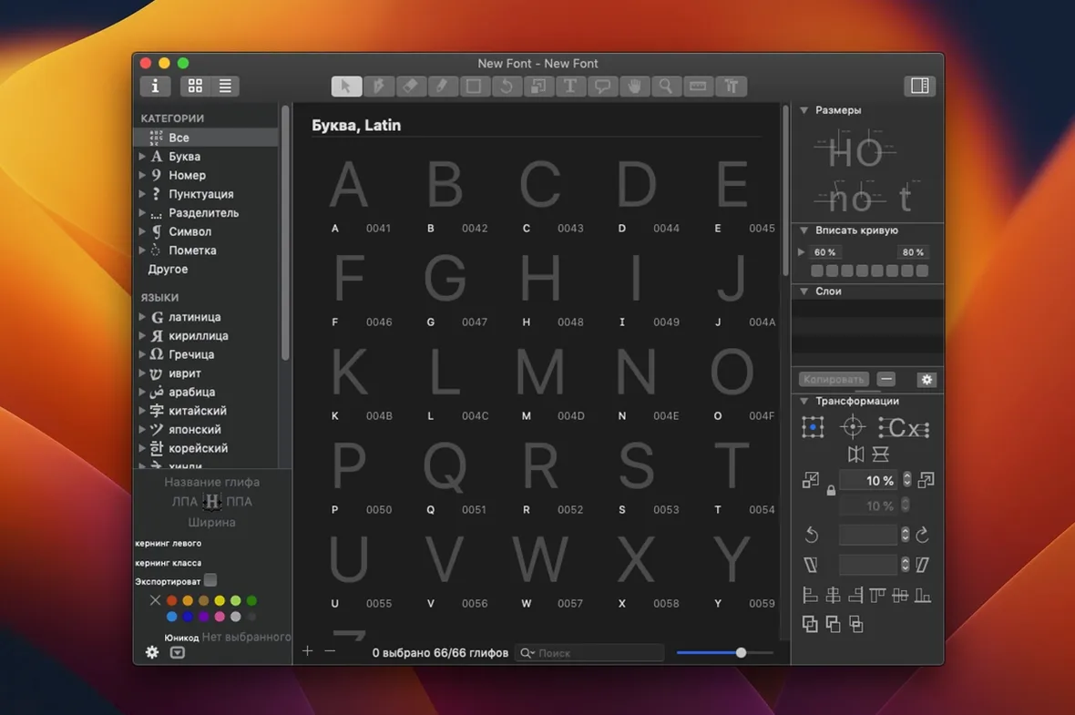
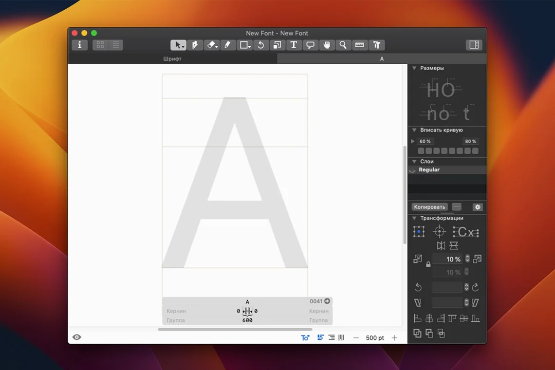
Build 4.1.1 landed as a maintenance release in September 2026, quietly tightening the corners that experienced type designers lean on hardest. If you spend your days inside bezier curves and OpenType feature code, the release notes matter less than what the application lets you reach when a family of weights needs to behave across scripts. Glyphs keeps its interface pared back to the elements a font project actually requires, and that restraint is most visible once you move past the basics of creating a new file or editing an existing upright.
- Multiple Master and brace layers. Interpolate weights, widths or optical sizes while keeping outline compatibility under control.
- Smart component placement. Diacritics that position themselves relative to the base glyph, even as sidebearings shift during spacing passes.
- Contextual menu text editing. Rename glyphs, swap components or adjust anchors directly from a right-click without leaving the Edit view.
- Custom parameter stacks. Push Python snippets or pre-built parameters at the glyph, master or instance level to automate repetitive drawing tasks.
- OpenType feature preview. Step through substitution and positioning rules live before exporting a single binary.
- Native Apple Silicon and Intel support. Heavy interpolation tables and complex path operations stay responsive on both architectures under macOS 12 and later.
The interface ships in thirteen languages, though the coordinate grid and the node handles read the same in every one of them. For a designer who has moved past sketching single weights, the depth is in the layers — literally and structurally.
Working out a new weight axis from a single light master is a good way to see how Glyphs holds a design together. Open a file with a finished upright, duplicate the master in the Layers panel and rename it Bold, then push the stem widths with the transform tools while keeping a close watch on the curve tension around the joins. The real test comes once you switch to the Compare view and scrub between the two masters with the virtual slider — any kink or collapsing counter shows up immediately as the outlines interpolate. From there, you can drop a brace layer on the problematic glyph, draw the corrected shape only for the middle of the axis, and let the renderer fade it in and out without touching the extremes. Export an OpenType variable font, pop it into the Adobe Fonts folder, and test it inside InDesign with a paragraph that mixes Latin and Cyrillic. The axis slider in the Character panel will let you drag through every weight in between, and the brace layer fixes should hold the rhythm across the whole spectrum.
Coffee, a geometric sans, and fixing that heavy /a bowl in the Edit view
You sit down with coffee and a half-drawn geometric sans. The lowercase /a has been bothering you since yesterday — the bowl feels too heavy next to the /e in running text. You open the Edit view, select the /a, and turn on Show Stem Thickness from the View menu to see the measurement callouts overlaid in blue. The right-side stem reads four units wider than the /e, so you marquee-select the inner nodes on that side and nudge them left with the arrow keys while watching the interpolation preview flicker in a second window. A quick tap of Cmd+Return opens the glyph in a full word context using the built-in text preview; you type “handglaze” and watch the /a settle into place. Satisfied, you move to the /g — it needs a shorter descender for the tight leading in the client's brand guidelines. You drop a new metric key on the descender zone, adjust the vertical metrics in File → Font Info, and re-export a test TTF. The whole session runs inside forty minutes and you never once open a separate preview application.
Fewer nodes on one master cause most variable-font export failures
The most frequent head-scratcher is interpolation throwing “compatibility mismatch” warnings when you try to export a variable font. Nine times out of ten, the culprit is a glyph where the two masters have a different number of nodes or the path directions have flipped between the light and bold extremes. The fix is to select the glyph, open the Layers panel, and use Path → Correct Path Direction on both masters, then run Reinterpolate to see if the error clears. Another snag shows up when OpenType feature code refuses to compile — usually a missing semicolon in a substitution rule or a glyph name that does not match the encoding. The built-in feature editor highlights the offending line in red, and you can click the error message to jump straight to the broken lookup. When the sidebearings feel off after a spacing pass, check that you have not accidentally locked a metric key on a glyph that should float free; the sidebar lists all locked metrics in a compact table you can clear with a single right-click.
UFO files open natively and keep their anchors and guidelines
People want to know whether Glyphs will open the UFO files they have been carrying between projects. It will — File → Open handles UFO natively, and you can save back to that format without losing anchors or guideline data. Another question is about the learning curve for someone coming from FontLab or RoboFont. The drawing tools map to the same pen-and-node logic, but Glyphs hides the complexity until you ask for it: the default workspace shows one master and one view, and you pull up the layers and axes panels only when you need them. Some designers worry about plug-in compatibility because they rely on custom scripts for kerning or batch export. The plug-in manager sits under Window → Plugin Manager, and most community scripts install by double-clicking a .glyphsReporter or .glyphsPalette file — the application drops them into the right folder and they appear after a restart. A handful of users ask whether a glyphs free download mac will carry the same feature set as the full release, and the short answer is that the build available here is complete, with all the drawing, interpolation and export tools intact, ready for macOS 12 and later on both Intel and Apple Silicon machines without any additional activation steps.
Glyphs rounds off a few rough edges in build 4200 so the vector work stays fluid and nothing gets in your way.
- macOS 12 or later
- Apple Silicon or Intel 64-bit Mac
Questions from the booth
Yes, you can open and edit existing fonts alongside creating new ones, making it suitable for revising retail families or updating in-house typefaces.
Glyphs 4.1.1 supports both Apple Silicon and 64-bit Intel Macs, and requires macOS 12 or a later release.