

When a spreadsheet hits its limits and a general statistics package feels like piloting a spacecraft, scientists need a tool built for the rhythm of experimental work. Prism steps into that gap — it is designed to take you from raw data to publication-ready graphs with analysis that explains itself along the way.
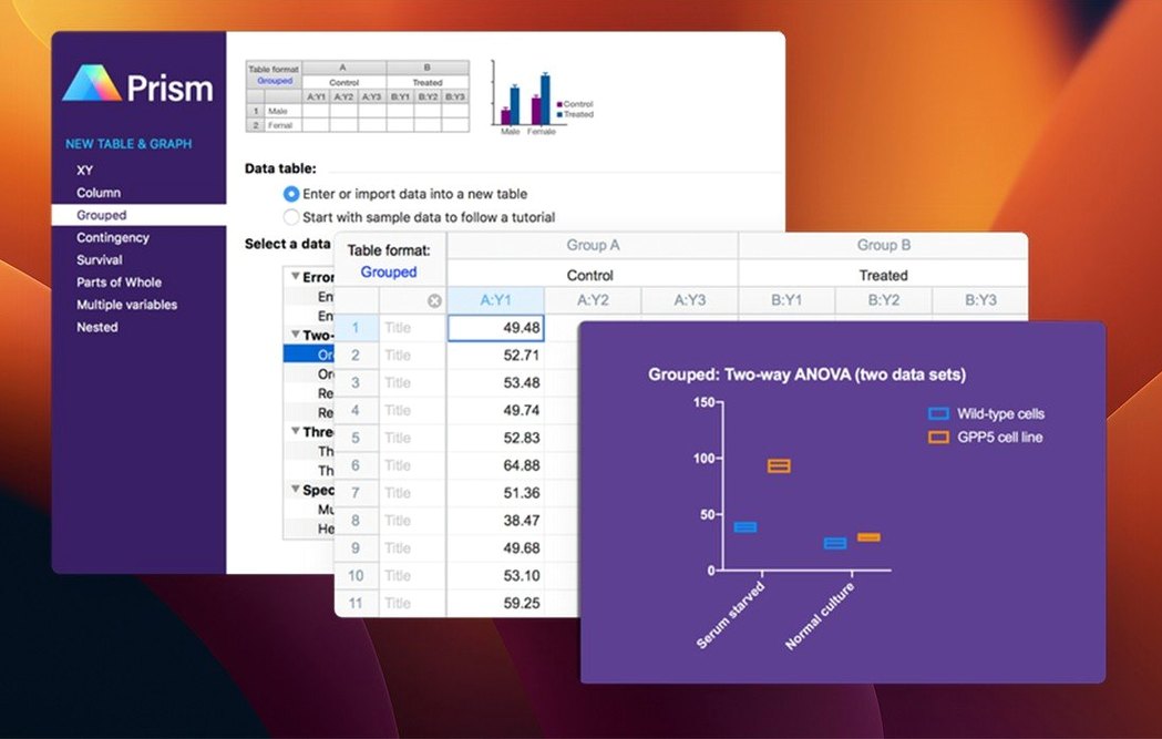
- Bring in your data. Prism structures tables around the experiment, not the other way around. Multiple variables tables, grouped and repeated-measures layouts, and survival data all have dedicated formats, so the software already understands the design before you run a test.
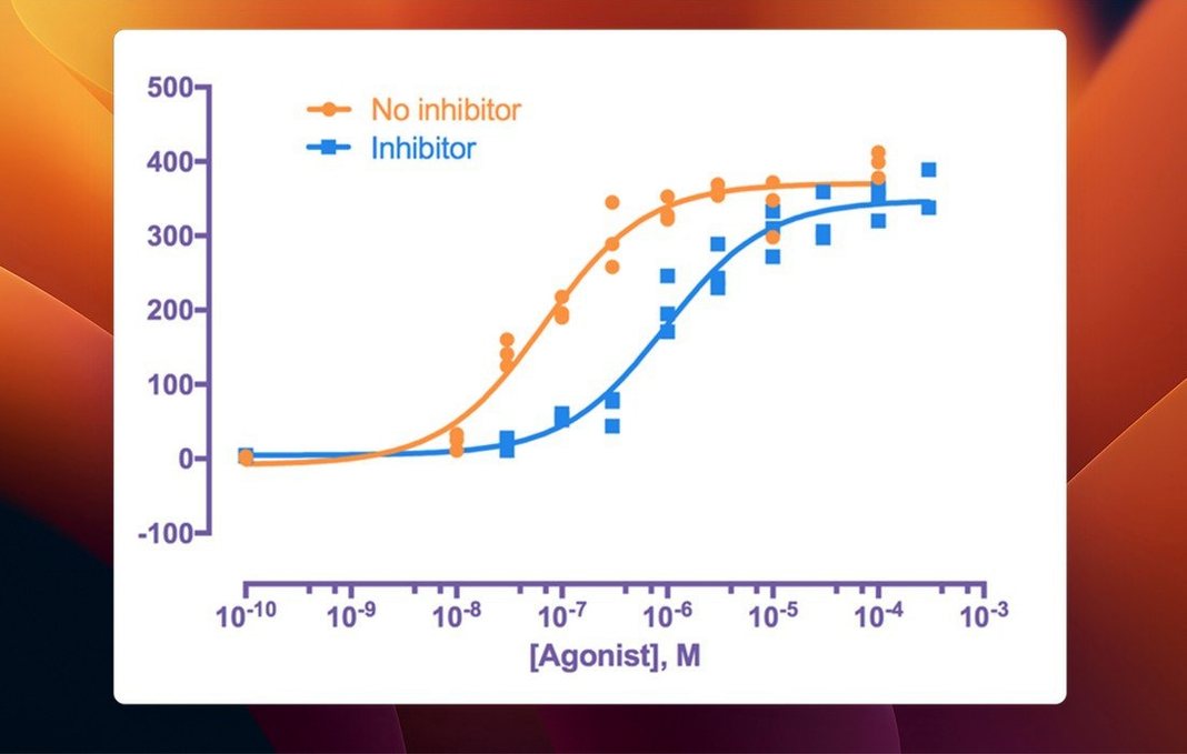
- Choose the analysis — or let the software guide you. Built-in test selection helps you pick the right statistical approach. Nonlinear regression, ANOVA, t-tests and dose-response curves are all available, with plain-language output that interprets the results rather than just printing p-values.
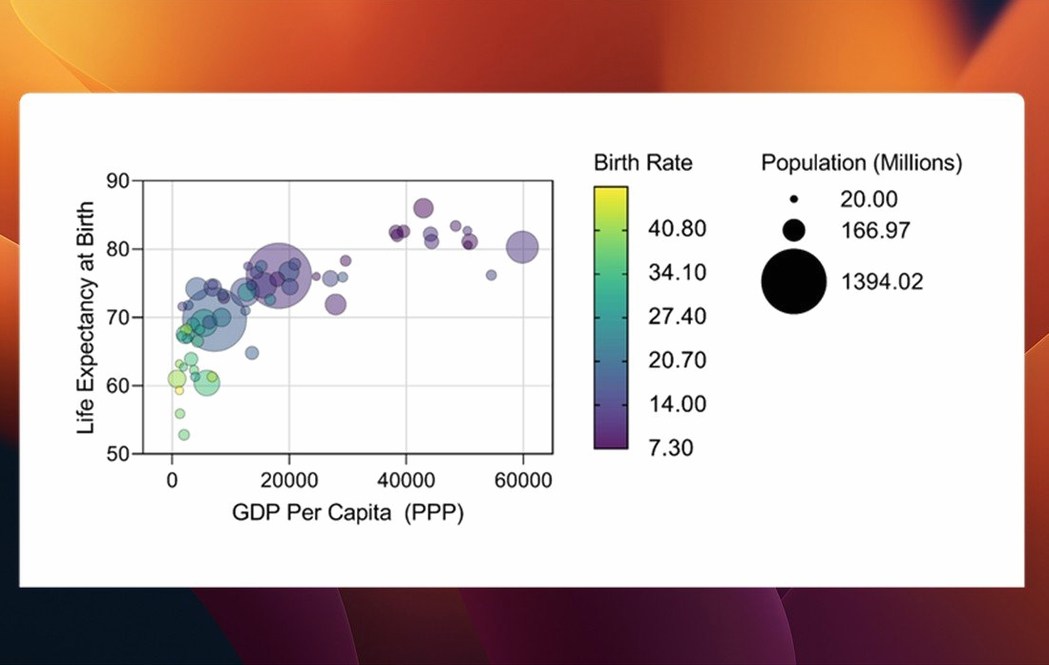
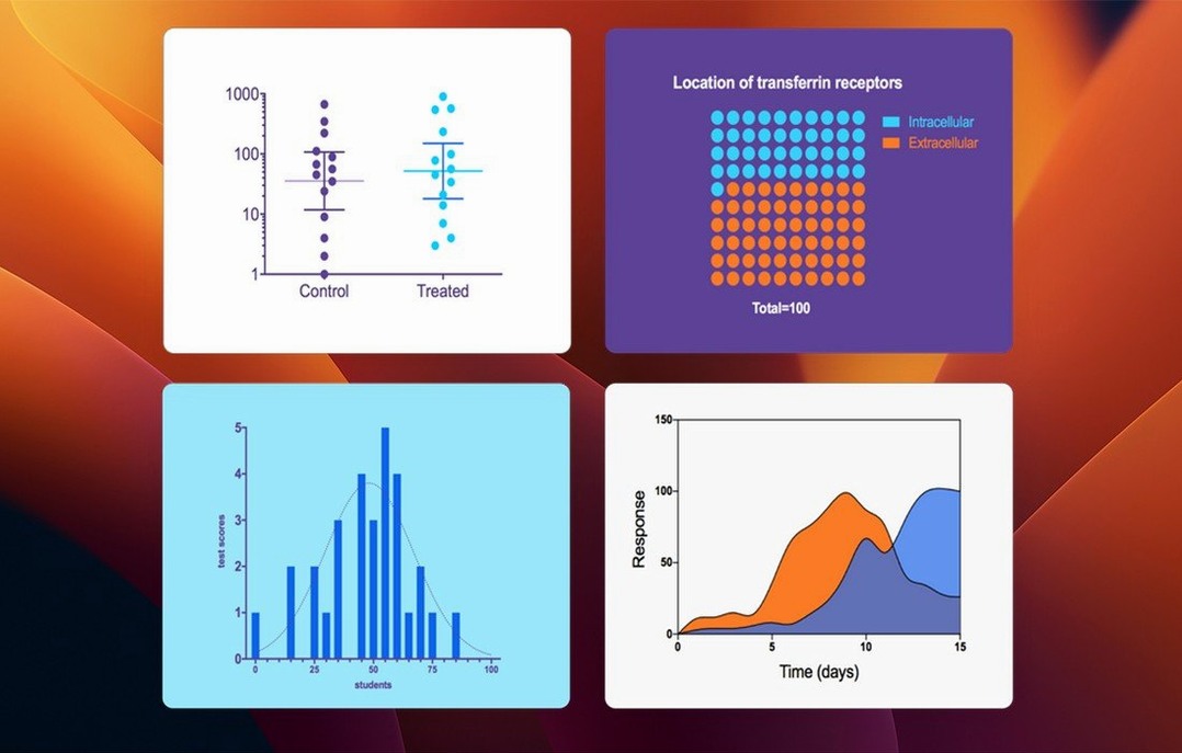
- Graph as you go. Graphs update automatically when data or analyses change. The latest version adds new graph types for multiple variables tables and lets you control categorical level ordering, giving you finer command over how comparisons appear on the page.
- Refine and export. Every element of a graph is adjustable, from axis breaks to colour schemes, so the figure that leaves Prism is often the one that goes straight into the manuscript.
Version 11.1.0 runs on Apple Silicon and Intel Macs with macOS 11 or later, and ships with more than 60 bug fixes alongside the workflow improvements. It is a single application that handles the full arc of an experiment — organizing data, testing hypotheses, and building the visual argument — without switching tools mid-thought.
Structured data tables that understand your variables
The jump to version 11 brought a quiet but meaningful shift in how multiple variables tables behave. Instead of treating every column as a separate entity, Prism now understands that your data has structure — independent and dependent variables, grouping factors, repeated measures — and it carries that understanding through to the graphs. The 11.1.0 update added bars, box-and-whisker plots, and violin plots as first-class citizens for these tables, which means you can sketch out an exploratory figure without first flattening everything into a simpler format.
Variable selection inside analysis dialogs got smarter too. When you run a t-test, a multifactor ANOVA, or a nonlinear regression, the parameters dialog now surfaces only the variables that make sense for that analysis, in the order the experimental design suggests. It sounds small, but it cuts down on the accidental nonsense results that happen when you select the wrong column from a long list at hour four of a late session.
Categorical level ordering for multiple variables data is the kind of feature that feels overdue once you use it. Instead of accepting alphabetical sorting of your treatment groups, you can set the display order to match the logic of the experiment — vehicle, low dose, high dose — directly in the data table. The graphs follow. The 60-plus bug fixes in 11.1.0 also tidied up edge cases in graph rendering and data import that long-time users had learned to work around.
Where publishable graphs bypass the Illustrator detour
Prism occupies a specific niche. JMP offers deeper exploratory modelling and a more flexible data table, but its graph output rarely feels finished without additional polish. Scientists who publish frequently find themselves exporting JMP figures into Illustrator or Affinity Designer, whereas a Prism graph often lands in the manuscript with only minor adjustments. JMP rewards statistical fluency; Prism rewards knowing your experiment.
R and RStudio provide unlimited analytical depth and complete reproducibility through scripts, which Prism does not attempt to match. But R demands comfort with code, and the path from a linear model summary to a properly formatted figure with error bars and grouped colours can consume an afternoon of tweaking ggplot2 parameters. Prism collapses that path into a few clicks and a live preview. Many labs use both: R for bespoke analyses, Prism for the standard repertoire and the final figures.
Numbers and Excel are where data often begins, and they handle basic descriptive statistics competently, but neither was built for nonlinear regression or survival analysis. Prism imports Excel files directly and preserves the experimental layout, which makes it a natural second step rather than a replacement for the spreadsheet.
Redoing t-tests and ANOVAs without rebuilding graphs
Graduate students and postdocs in the life sciences are the most obvious beneficiaries. They run the same set of analyses — t-tests, one- and two-way ANOVAs, dose-response curves — across multiple experiments, and the time saved by not rebuilding graphs from scratch each round adds up over a thesis. The built-in test selection and plain-language output also serve as a guardrail when statistics training is still fresh.
Principal investigators and lab heads who review figures before submission value Prism for a different reason: consistency. When every graph in a paper comes from the same tool, with the same typography and the same colour logic, the manuscript reads as coherent even when the data spans three years of work. Clinical researchers running survival analyses or repeated-measures designs find the dedicated table formats cut out the setup errors that creep in when you adapt a general tool to a specific design.
Biostatisticians who consult across multiple labs often keep Prism installed alongside their heavier tools. It is fast for sanity-checking a colleague's data, generating a quick exploratory plot during a meeting, or teaching statistical concepts with immediate visual feedback — something a scripted environment does not easily provide.
Paste finished figures straight into Keynote or Word
Prism plays well with the macOS clipboard and drag-and-drop conventions. You can copy a graph as a PDF or TIFF and paste it directly into Pages, Keynote, or a manuscript in Word without intermediate files. For teams that use cloud storage, placing the Prism file in an iCloud Drive or shared folder lets multiple people open and annotate the same analysis, though only one person edits at a time.
Graphs exported as vector files move smoothly into Affinity Designer or Adobe Illustrator for final layout adjustments — journal cover art, figure panels that combine microscopy and data plots, or slides for a conference talk where the lab's branding needs to sit alongside the results. Prism does not try to be a layout tool, but it exports cleanly enough that it does not need to be.
On the data side, CSV and Excel imports cover most sources, and the clipboard accepts tab-delimited text from R or Python output. A researcher might run a custom Bayesian model in R, export the posterior summaries as a tidy table, paste it into Prism, and build the figure using the same graph style as the rest of the paper — keeping the bespoke analysis but unifying the visual language.
Prism 11.1.0, released August 19 2026, brings new graph types for multiple variables tables and adds categorical level ordering so you can control how levels appear in graphs and analyses. Variable selection in analysis dialogs has been streamlined, and the update includes more than 60 bug fixes.
- macOS 11 or later
- Apple Silicon or Intel 64-bit processor
- Interface: English