
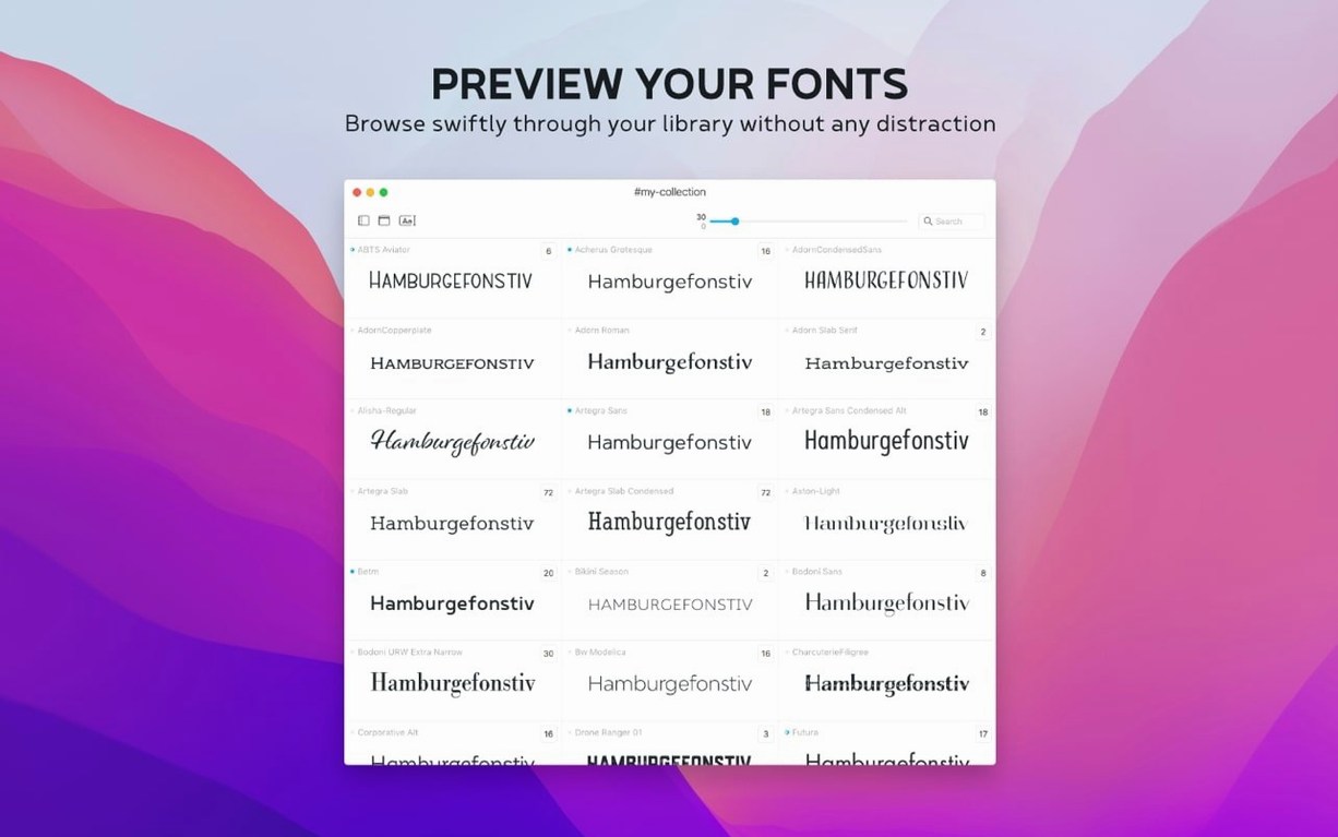
Typeface is a font manager that treats your collection less like a database and more like a contact sheet.
Drag in a messy folder and watch families sort themselves
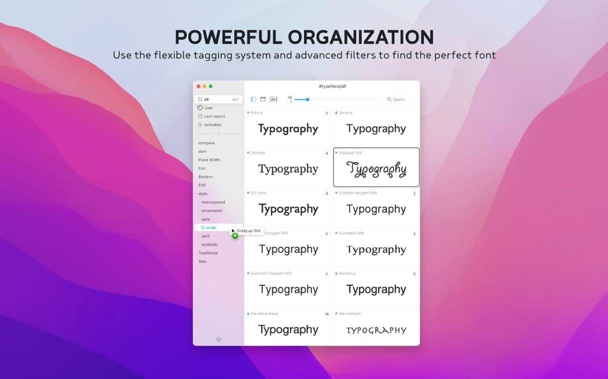
- Import without the noise. Drag folders onto the sidebar or pull in stray .otc files from a client delivery. Typeface parses them into families on the spot, no watch folders or background daemons required.
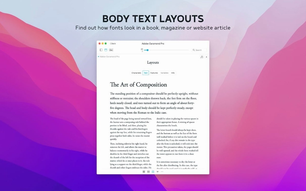
- Preview against your own copy. The sample text field accepts anything — a headline, a problematic glyph sequence, a paragraph lifted from a script. Change the size with a slider and watch the spacing breathe.
- Compare side by side. Select two weights, two cuts, or a candidate and the house style. The overlay view reveals which x-height actually matches and whether that geometric sans has the same colour on the page.
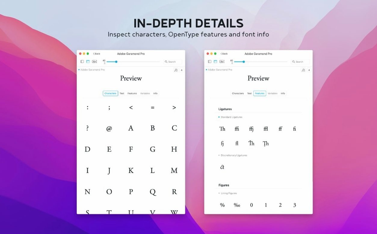
- Dig into the metadata. The information tab pulls up the copyright trail, designer credits, and technical metrics buried in the file. That alone has settled arguments about licencing mid-project.
- Let activation history guide you. Version 4.5 introduced a Last Activated column. Sort by it, and the fonts you reached for across the last three productions rise to the top while the rest stay out of your way.
- Tag and note what matters. Assign groups for a film’s end credits or location cards, then add searchable notes — optical size quirks, which weight held up on the projector test, a reminder to check the licence territory.
Everything sits in a single window with a preview pane that stays live as you arrow through the list. The app speaks English, German, Dutch, French, Czech, and Japanese, and it reads every font the system knows plus anything you point it at. It doesn’t try to be a catalogue for 80,000 dormant files. It is built for the working handful you actually need to understand.
Swap the sample text to a phrase with ascenders and numerals
A few preferences tucked behind the gear icon shape how Typeface feels day to day. The default sample text is serviceable, but replacing it with a phrase that contains ascenders, descenders, and a numeral — something like Highway 61 at dusk — tells you more about a typeface in one glance than a pangram ever will. Set this once in the preview pane and Typeface remembers it across sessions.
Switch the sidebar to show fonts grouped by family rather than listed individually. When you are working through a dozen weights of a single sans for title cards, collapsing them into one entry cuts the visual noise in half. The preview pane still lets you step through each weight with the arrow keys, so nothing is lost.
If you pull fonts from client folders regularly, point the app to a watch folder in preferences. Typeface does not advertise this loudly, but it polls designated directories and surfaces new arrivals without a manual import. For productions where assets land in a shared Dropbox folder at odd hours, this keeps your candidate list fresh without thinking about it.
Turn on the glyph grid early. The information tab shows character coverage, but the grid lays out every glyph in a selected font as a contact sheet — punctuation, ligatures, currency symbols, the full set. Spotting a missing ł or an incomplete fraction set before you build title templates saves a scramble later.
Font Book activates, but Typeface layers glyphs on top of each other
Apple’s Font Book ships with every Mac and handles basic activation and collection management. It is fine for installing a handful of Google Fonts or disabling a conflicting version. What it lacks is the side-by-side overlay and the metadata depth that Typeface surfaces without extra clicks. Font Book tells you a font is installed; Typeface tells you whether it will work for the shot.
RightFont is the choice in studios where fonts live on shared servers and multiple designers need live activation across Adobe CC. Its auto-activation plug-in is the reason it appears on many agency machines. Typeface takes a quieter approach — no background agent, no plug-in architecture. For a filmmaker or a solo designer working on a MacBook on location, that restraint is a feature. The app opens, shows your working set, and quits without leaving processes behind.
Typeface also lacks the cloud-sync ambitions of tools like FontBase. There is no account to create, no library that follows you across devices. The trade-off is straightforward: your font previews and notes stay local, and the app launches instantly because it is not checking a server. On set, where Wi-Fi is unreliable, that matters.
It reads your font folders without touching the system database
Does it mess with the system font database? No. Typeface reads from the standard macOS font directories and any folders you point it at, but it does not move, rename, or activate fonts at the system level. It leaves Font Book’s domain untouched, which means you can run both side by side without conflicts.
Will it handle a large library without beachballing? The app stays responsive with a few thousand fonts loaded, though the real performance factor is preview rendering. Keeping the preview pane on a moderate sample size rather than a full paragraph of lorem ipsum keeps scrolling snappy. Collections and tags help you narrow the view to a working subset, so you rarely need to browse everything at once.
Can I export a font sheet or a comparison for a client? Typeface does not have a built-in export-to-PDF function, but the preview pane copies as a high-resolution bitmap. Paste it into a Keynote slide or a framing chart and you have a client-ready type shortlist in seconds.
Some older .otc collections hide faces that won't parse
.otc files not appearing after import. Support for OpenType Collection files arrived in version 4.5, but if the collection was built with an older compiler, some faces inside may not parse. The workaround is to extract individual .otf files with a command-line tool like otc2otf and import those separately. Typeface handles the resulting files without a hitch.
Custom sample text reverting between sessions. A handful of users have noted that the sample text field resets if the app quits unexpectedly rather than through the normal menu command. The fix is deliberate: after setting your preferred sample string, quit and relaunch Typeface once normally. macOS writes the preference plist on a clean exit, and the text sticks from that point on.
Fonts showing as duplicate entries. This usually traces back to the same font file existing in both the system Library and a user Library folder, or a font suitcase that contains multiple copies. Typeface lists each file path it finds. Use the information tab to check the file location and remove the redundant copy from one directory — the duplicate vanishes from the sidebar on the next relaunch.
Tags not appearing in search immediately. Tags assigned in the current session are indexed live, but notes added to the new Notes field may need a moment. If a note search returns nothing, click away from the font and back again to force the index refresh, or toggle the search scope in the toolbar. The feature is young and a point-release will likely tighten the timing.
Typeface 4.5 brings a Notes field to the Info tab, making it possible to attach production notes directly to a font. Those notes are now searchable from the overview, so a remark about a specific rendering bug is never more than a keystroke away. The release also adds a Last Activated column with sorting, support for .otc font collections, and a few quiet refinements that keep the preview pane feeling immediate.
- macOS 12 or later
- Apple Silicon and Intel Macs