

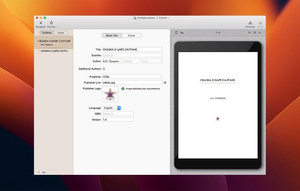
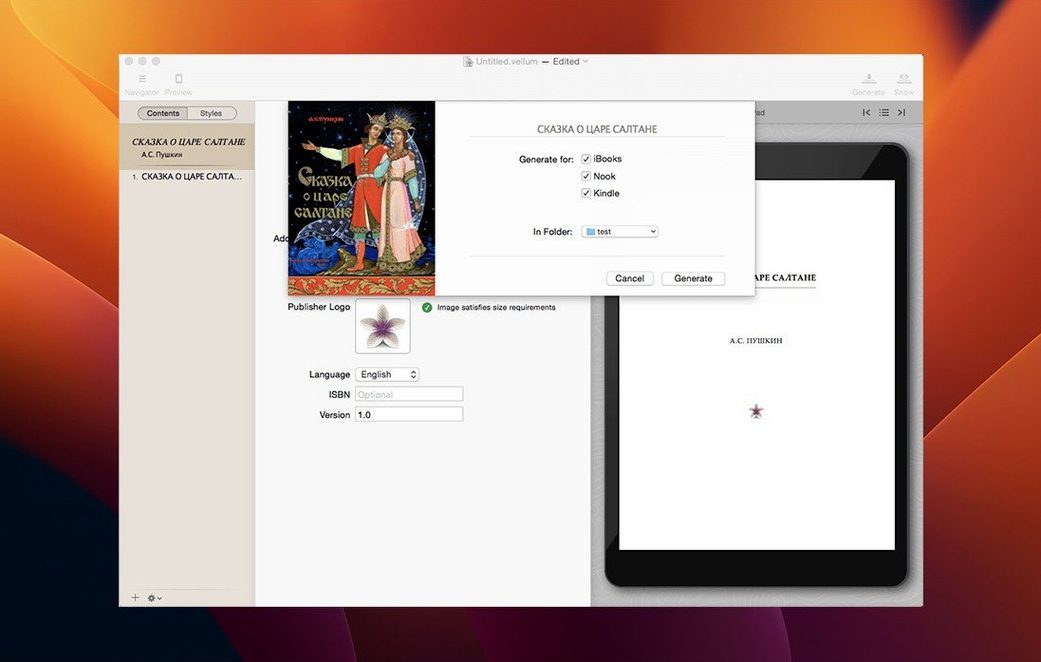
Even the title page and table of contents appear the moment you pull a manuscript in. Vellum works from the book outward, giving each chapter a single style that follows it everywhere — add a new chapter, and it inherits the look without a second thought. Instant preview — any edit to text or style refreshes the book preview at once, so you see exactly how a drop cap sits or where a scene break falls. Style per chapter — set a typographic treatment once, and every page in that chapter holds it; new chapters take the same rules automatically. Dual-format generation — a single project can produce both a print-ready interior and a reflowable ebook, without duplicating work. Boxed sets — multiple books can be bundled into one omnibus edition, sharing the same styling engine. Multi-platform output — the app writes files for Kindle, Kobo, and Apple Books without extra conversion steps. The whole thing runs on Apple silicon and Intel Macs under macOS 11 or later, staying responsive even with long novels and image-heavy layouts.
Treating Vellum like a word processor starts a cascade of editing dead ends
Most new users open Vellum expecting a word processor. It is not one, and fighting that instinct leads to the first cluster of frustrations. People paste a manuscript, spot a typo, and try to rewrite a sentence inside the preview pane — then wonder why the formatting stutters. Vellum is a book builder, not an editor. Clean the prose in your writing app of choice before importing, and treat Vellum as the place where the manuscript becomes a book.
Another early stumble: ignoring the style browser entirely. Beginners often accept the default look, tweak a font size manually in one chapter, then repeat the same adjustment by hand in every other chapter. The style browser sits in the left panel for a reason — pick Heading Style or Body Style there, change it once, and the whole book shifts together. Manual overrides inside individual chapters create a fragile mess that unravels the moment you switch trim sizes or regenerate a format.
Image handling catches people off guard, too. Dragging a high-resolution photograph straight from a camera roll into a chapter bloats the ebook file and slows the preview to a crawl. Vellum does not downsample images aggressively on its own — authors who skip the built-in image optimisation step end up with 20 MB Kindle files that Amazon then compresses into a muddy, artefact-ridden mess. Resize and compress images before import, or at least check the file size warning that appears in the element inspector.
A subtler mistake involves the copyright page. New users leave it blank, planning to fill it in later, then hit Generate and ship an ebook with an empty front-matter page sitting between the title and the first chapter. The copyright-page editor inside Vellum is a small text field, easy to overlook, but leaving it empty is visible to every reader who opens the sample. Fill it in early — ISBN, edition note, a short rights line — so the generated file is complete from the first export.
One-person publishers juggling multiple storefronts in a single week
Self-publishing authors running a one-person operation gain the most from the app, particularly those who release on multiple storefronts simultaneously. Someone preparing a novel for Kindle Direct Publishing, Kobo Writing Life, and Apple Books in the same week saves hours of format wrangling — one project, three export buttons, and the files validate on each platform without a trip through Calibre or Kindle Previewer for fixes. The time saved compounds with every new title in a series.
Small independent presses benefit almost as much, especially when handling backlist conversions. A publisher with forty out-of-print titles to bring into ebook form can set a house style once, save it as a template, and process a manuscript per day without hiring a layout designer for each book. The boxed-set feature alone justifies the workflow: bundling a trilogy into one omnibus edition, complete with its own title page and unified table of contents, takes under ten minutes once the individual books exist.
Writers who think visually — people who care about drop caps, ornamental breaks, and how a chapter opening sits on the page — find Vellum's instant preview indispensable. Editing a scene-break ornament and watching it appear live on a simulated Kindle Paperwhite or an iPad screen, without exporting and sideloading a test file, turns typographic decisions from guesswork into something immediate. Print-focused authors who need to see how their trim size choice affects page count and margin balance before committing to a proof copy get the same advantage on the print side.
The rewritten text engine that finally tamed doorstop fantasy manuscripts
Version 4 brought a rewritten text engine that changed how Vellum handles large manuscripts. Books that previously caused the preview to lag — doorstop fantasy novels with a hundred chapters and dozens of inline images — now scroll smoothly during editing. The same engine underpins the print-layout improvements: widow and orphan control became more aggressive and more configurable, so a heading no longer sits alone at the bottom of a page unless you deliberately allow it.
The spread-balancing logic got a quiet but meaningful update. In print projects, facing pages now adjust more intelligently when a chapter ends on a right-hand page — Vellum inserts a blank verso automatically, keeping the next chapter opening where a reader expects it. Ebook users gained finer control over the title page, with new layout options that let you move the author name, subtitle, and publisher mark into arrangements that feel less templated than earlier versions.
Switch your print trim size before you begin, or reformat an entire book later
The default trim size for print projects is 6 × 9 inches, the American trade paperback standard. If you publish in the UK or Commonwealth markets, switch this to a B-format size like 5.06 × 7.81 inches before you begin styling — changing it later reflows every page and can shift carefully placed scene breaks onto awkward spreads. The setting lives under File → Print Settings and applies instantly across the whole project.
Under Preferences, turn on Show invisible characters while you clean up an imported manuscript. Vellum imports text faithfully, including stray tabs, double spaces, and manual line breaks that a word processor hides. These artifacts become visible as pale blue markers and are easier to hunt down before they create phantom blank lines or indentation oddities in the finished ebook.
The element inspector for each chapter includes a Start on new page toggle that defaults to on. For flash fiction collections or poetry chapbooks where several short pieces share a page, turning this off per chapter saves paper in print and avoids a jarring sea of white space in the ebook. The opposite applies to a novel's front matter — make sure the copyright page, dedication, and epigraph each have the toggle on, so they do not bleed together on a single screen.
Finally, dig into the style browser's advanced tab for body text and reduce the default paragraph spacing slightly — Vellum ships with generous after-paragraph spacing that reads well on a phone but can make a print book feel padded. Dropping it by one or two points tightens the page without crowding the text, and the change propagates to every chapter the moment you confirm it.
- macOS 11 or later
- Apple Silicon or Intel 64-bit